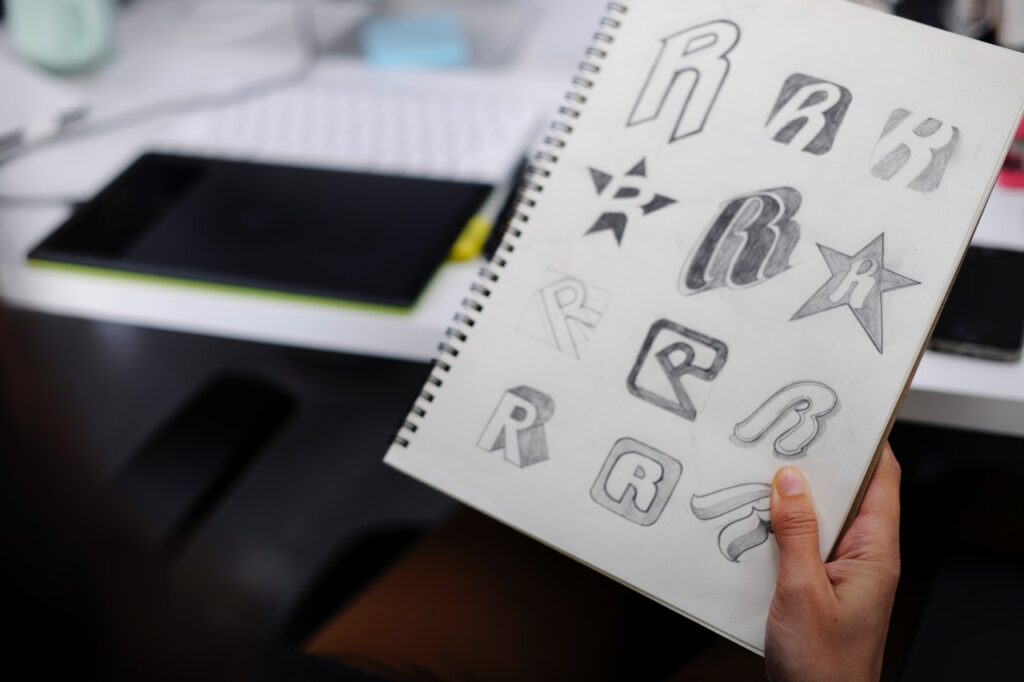
If you’re a graphic artist or designer, you may experience greater challenge in proving your craft these days. Besides, with modern technology giving resources and ways to help you excel, you have no excuse to disappoint your clients and viewers. Hence, take time to check out recent logo design ideas, so you can plan well in giving a fresh look and good branding to your clients. Here are trendy techniques and styles to inspire you to improve your creative skills.
Best Logo Design Ideas in 2016
1. Letter Block.
This style uses geometric figures that include the firm’s initials or acronym. In particular, FilWeb Asia’s logo falls under this form. What’s good with this design is that it allows viewers to not just appreciate it but likewise figure out its hidden letters. Logos with this form come in squares because favicons favor this shape. Still, others prefer shapes that give a 3D finish and effect to the design. A few more brands with letter block emblems include Dirt Jockey, Milestone Construction, and Clements Dean Building Co.
2. “Modern” Retro.
While this form carries the qualities of vintage logos, it made a perfect comeback since it gives a fresh take on traditional styles the modern generation hasn’t seen. So, why are modern retro or vintage logos useful today? They’re striking and great at communicating a brand’s trivial nature. Brands that show this form include The Swagapple, Mixed Threads, Rock & Roll Drum School, and Colorado Beer Trail.
3. Negative Space.
One of the clever logo design ideas uses background space (often white). Yes, this creative technique doesn’t just make best use of the space but add a deeper (and sometimes double) meaning to the design itself. Further, through this technique, graphic experts can show images and send messages the business would want to stress. Then again, perfect examples that use negative space are The Swan and Mallard, Pittsburgh Zoo & PPG Aquarium, The Guild of Food Writers, and Snooty Peacock.
4. Half and Half.
Unlike the other three logo design ideas, this one allows graphic artists to improve their work by turning the boring flat tone into to an exciting one. They do this by using two different tones on the image. With this method, the designer breaks the surface tension while drawing away the viewers’ attention and interest. No wonder, many graphic artists ditch the flat tone and use this technique to break monotony and point to the brand’s vividness. Likewise, firms that use the tone-on-tone divide include Titan, Tarpon Construction, and Riverwood.
Got useful insights from our logo design list? Try these concepts and impress your clients with trendy logo design ideas to help them achieve business goals. In addition, to manage an overload in your graphic projects, hire our logo design services.
(Note: Logos mentioned here may not all reflect actual brands but may only be mere ideas for educational purposes. FilWeb Asia does not endorse them.)
Sources:
logolounge.com|creativemarket.com|designschool.canva.com|elegantthemes.com


